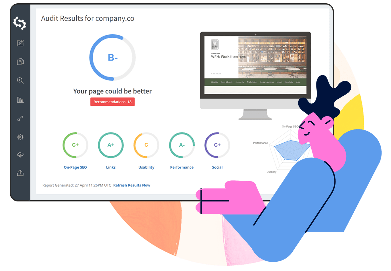
We're constantly impressed with how our customers implement the Embeddable Audit Tool on their website. So much so that we wanted to showcase some creative examples from customers utilizing several different design, layout and call to action methods.
Add the form to the Homepage, above the fold
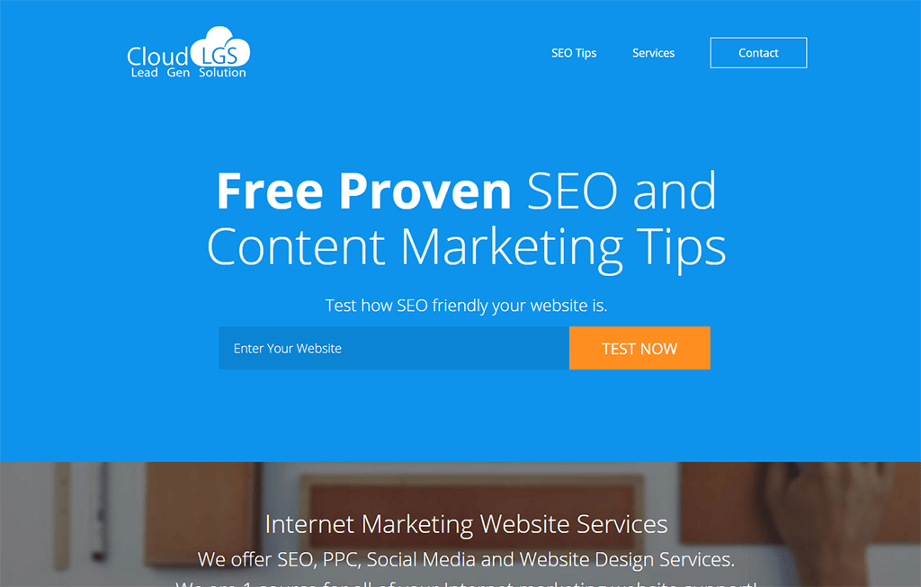
We recommend embedding the Audit Tool above the fold on the homepage to maximize exposure and lead conversion. Arizona-based SEO agency, Cloud LGS is a great example of this:
Use contrasting colors
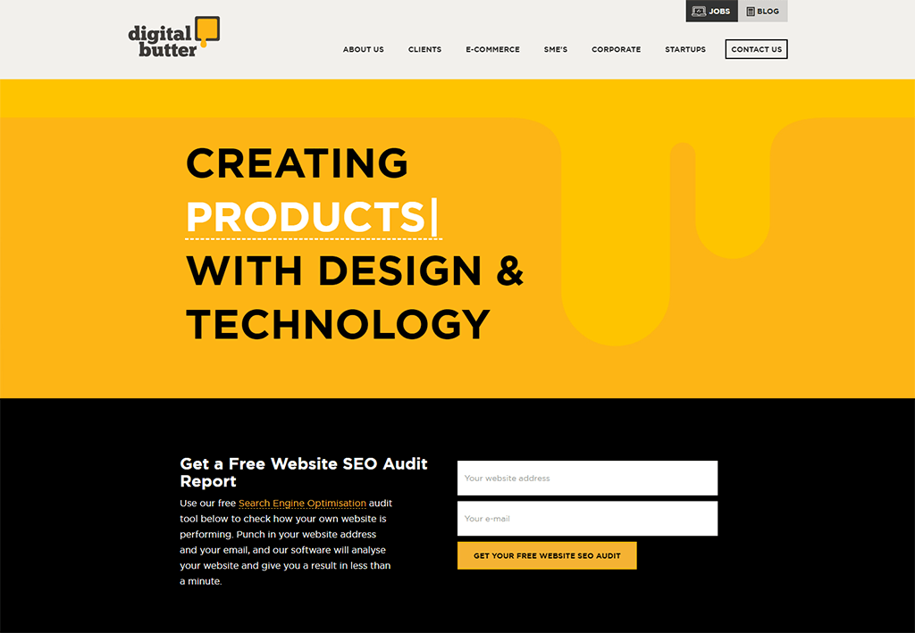
Hong Kong digital agency, Digital Butter implemented the Audit Tool on their homepage in a 2-column layout with a striking reversed black background:
Use a background image
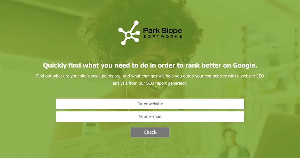
Background images can help highlight key areas of a page. New York-based digital agency, Park Slope Softworks use an eye-catching background image to highlight the Audit Tool:
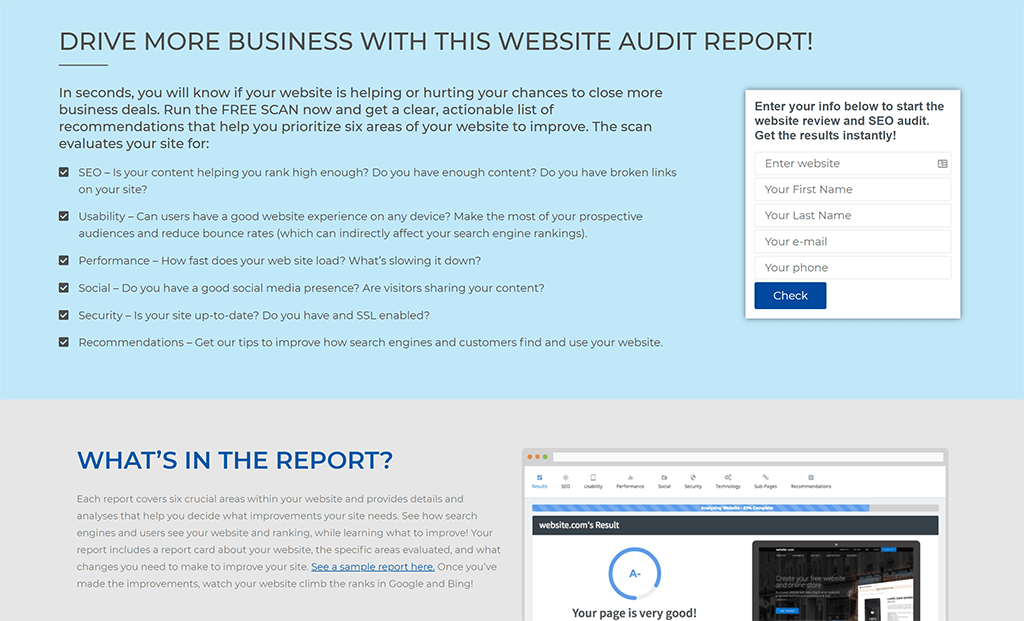
Explain what the report contains
Houston-based digital agency, Blue Atlas Marketing embedded the Audit Tool next to a full description of what the report contains. While this is a lot of text, it visually shows how comprehensive the audit report is. Below the form they have also included screenshots of an example report:
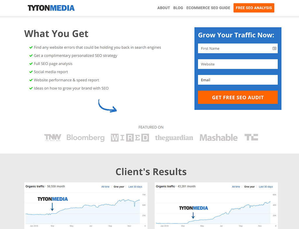
Another great example from Kansas-based SEO agency, Tyton Media:
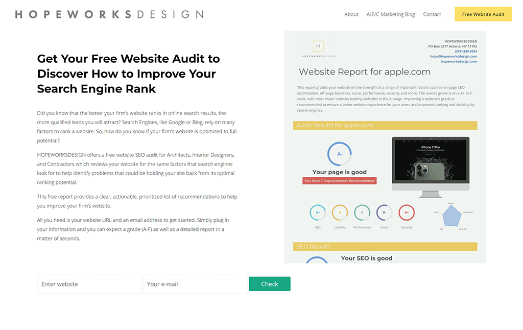
Show the user what they'll get
New York-based consulting firm, Hopeworksdesign use their white-labelled audit report as the hero visual to incentivize users to complete the form:
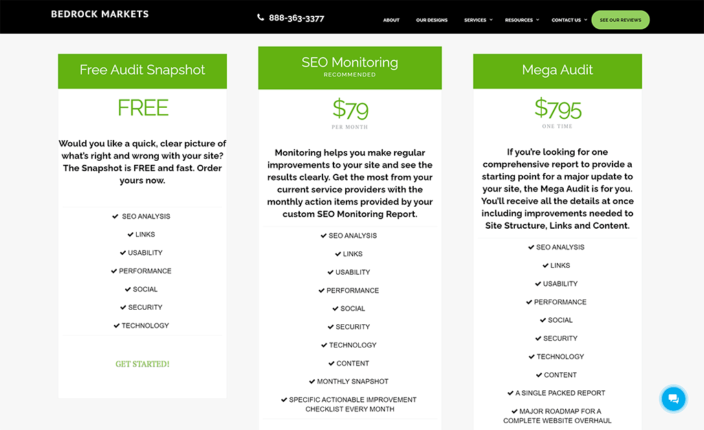
Use a price-anchoring tactic
Californian digital agency, Bedrock Markets use a "price-anchoring" tactic to increase the perceived value of a free audit. Their $795 Mega Audit acts as a price anchor heightening the value of the other options, especially the free option! Using a pricing table also helps to compare features and promotes the agency's subscription-based service:
Add a main menu button which links to a Site Audit landing page
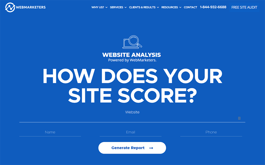
Creating a separate "Site Audit" landing page is useful if you plan to drive traffic from other channels such as email, social media or PPC. Canadian digital agency, WebMarketers has a "Free Site Audit" button in the top-right of their main menu which links to their custom-designed SEO audit landing page:
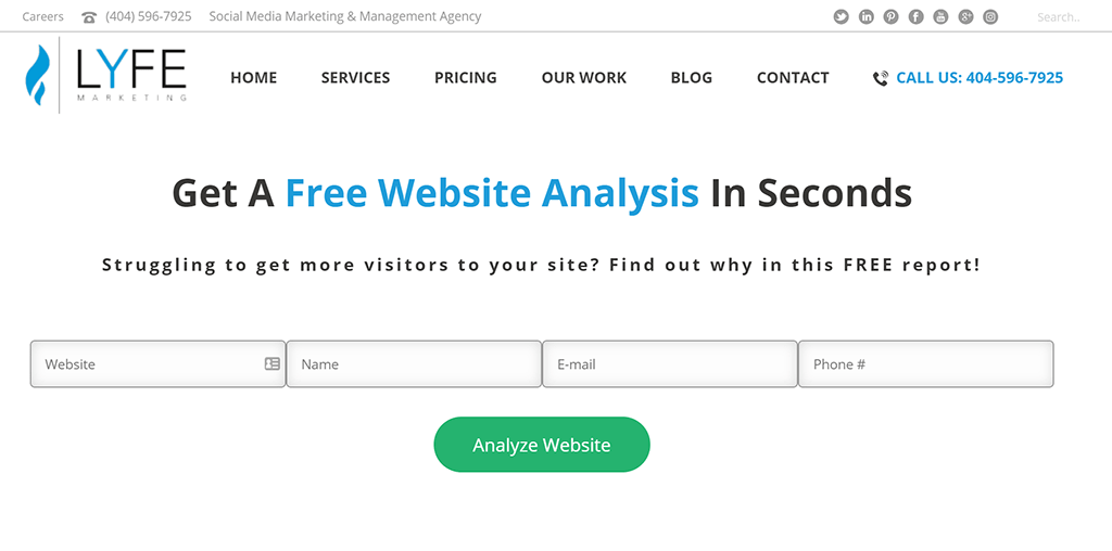
Atlanta-based digital agency, LYFE Marketing have also implemented a separate landing page focused on the call to action:
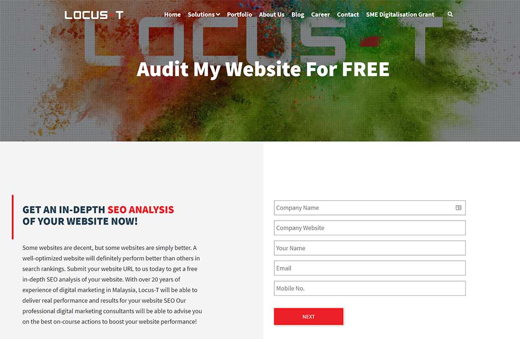
Another example from Malaysian digital agency Locus-T with a separate SEO Analysis landing page:
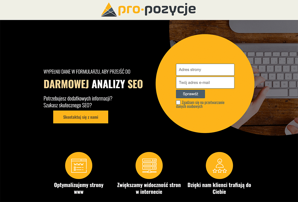
Finally, this landing page example is from Polish digital agency Pro-Pozycje:
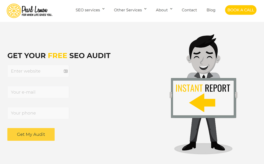
Use imagery, photos or illustrations
London-based SEO agency, Pearl Lemon uses an illustrated character to direct users' attention to the form:
Add the form to your SEO Services page
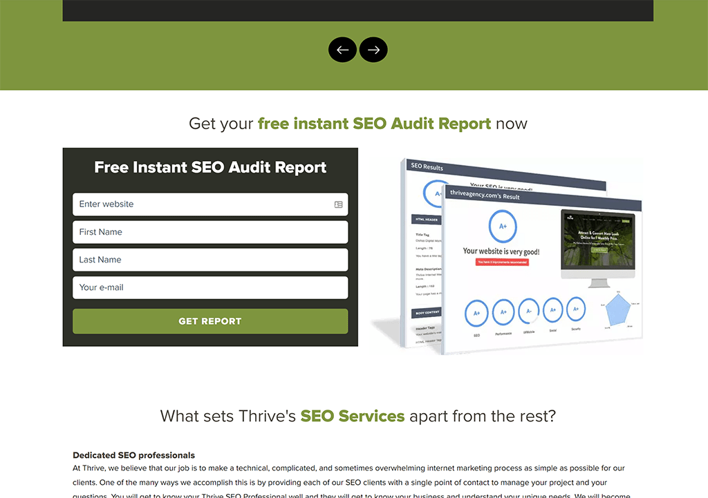
Texan digital agency, Thrive Agency embedded the Audit Tool on their main SEO Services page:
Add a main menu button which triggers a modal overlay
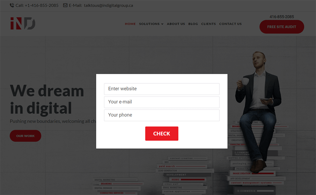
Canadian digital agency, INDigital Group use a similar top-right main menu button but instead of linking to a landing page, the button triggers a modal overlay containing the embed form:
Add a modal overlay as the user is leaving the site
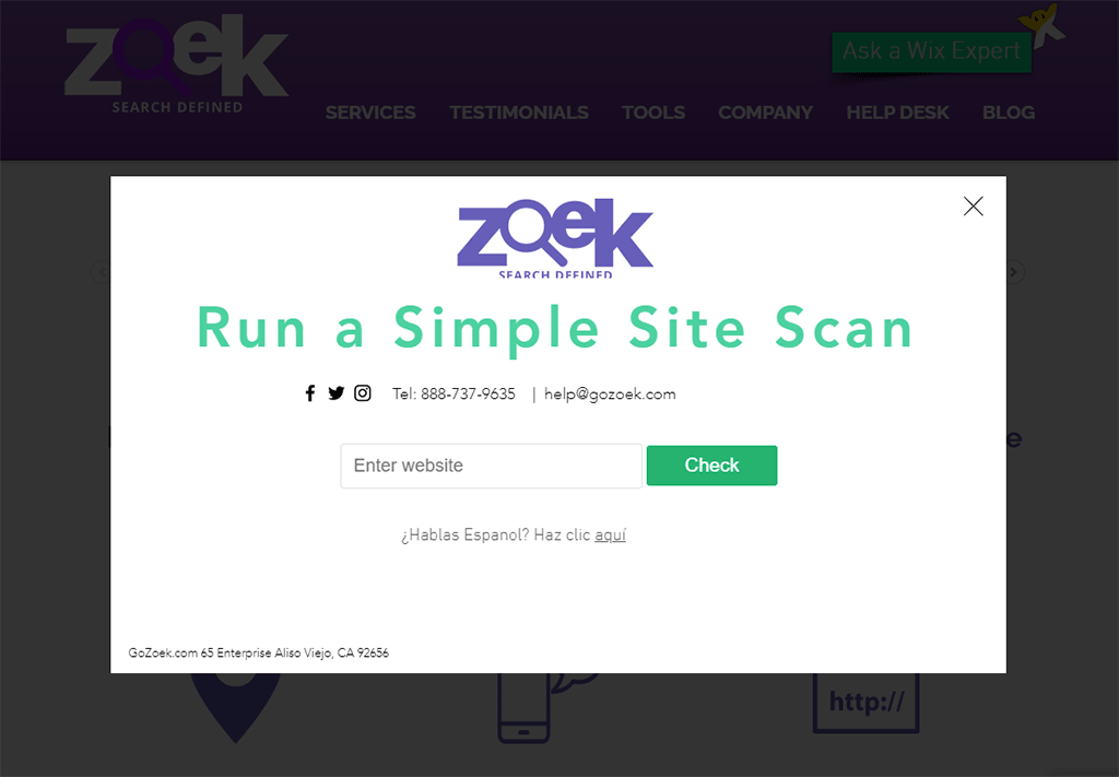
Californian digital agency, Zoek trigger a branded modal overlay which provides users with the Zoek-branded audit PDF as a great "take-away" after visiting the site:
We hope these examples inspired you to think about how the Embeddable Audit Tool could work on your agency's website. If you've implemented the tool and would like to be featured in this showcase, please get in touch with us!
